 Tandem Tasks
Genesis · design stage
The look of a list you keep together.
Logo concepts, the mark we shipped, and the full design-token system: one friendly teal accent, a calm neutral surface, red reserved strictly for overdue. Every candidate is kept here so the winner can be swapped later.
The mark
Duo Check
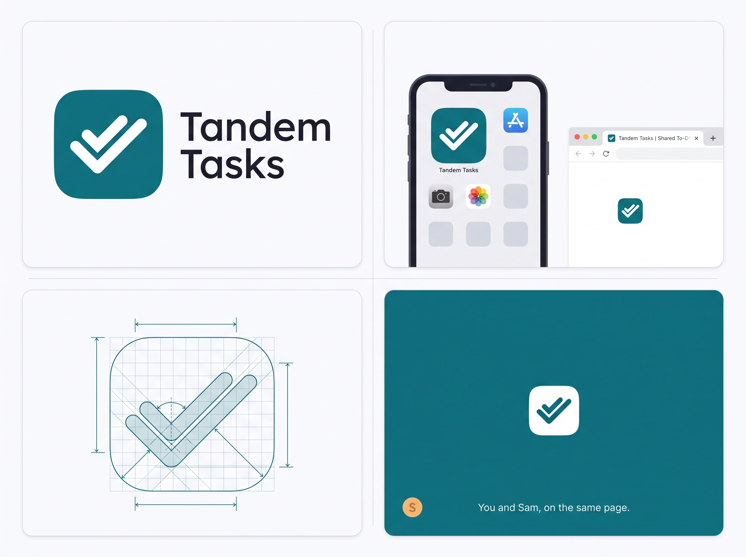
A rounded checkbox with a double tick: you checked it, they saw it. It stays readable all the way down to a 16 px favicon, which is why it won over the two alternatives.
One accent, many avatars, done together.
Teal #0E7C86 carries checkboxes and primary actions everywhere; the tick is the
product. Delivered as a clean hand-written SVG plus the full favicon / app-icon / OG kit.

Exploration
Three concepts, one palette
Each concept uses a different metaphor and was judged on how it survives at app-icon and favicon size. AI concept boards sold the idea; the shipped mark is hand-built vector.
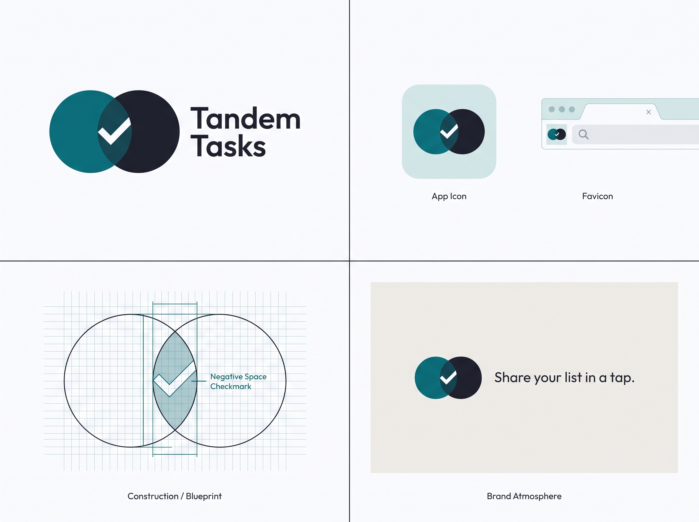
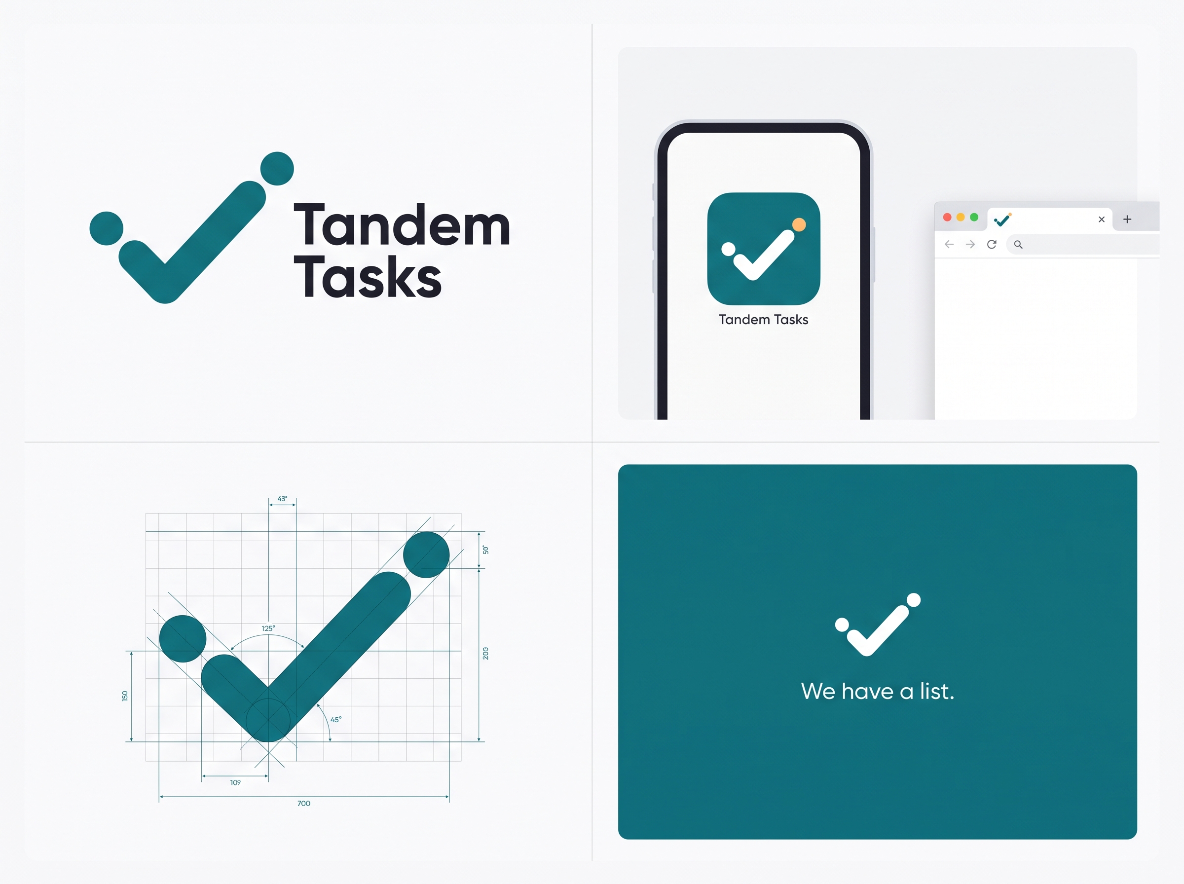
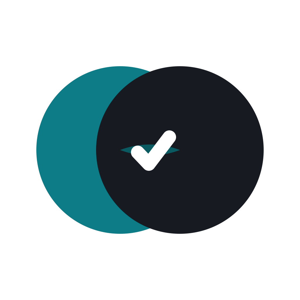
Both runners-up are kept as clean vectors too. The Overlap mark is the strongest re-pick.
Proof
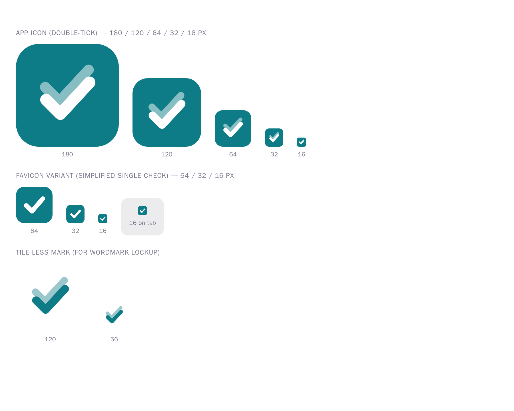
It holds at every size
Rendered at real pixel sizes. The double tick degrades gracefully to a single clear check at 16 px; the simplified favicon variant stays crisp in a browser tab.
The system
Design tokens
Light and dark, one accent, a 4pt spacing grid, and Plus Jakarta Sans. The single
source is brand/tokens.json, applied to the app and this landing. All colour pairs
pass WCAG AA (checked by brand/verify-contrast.mjs).
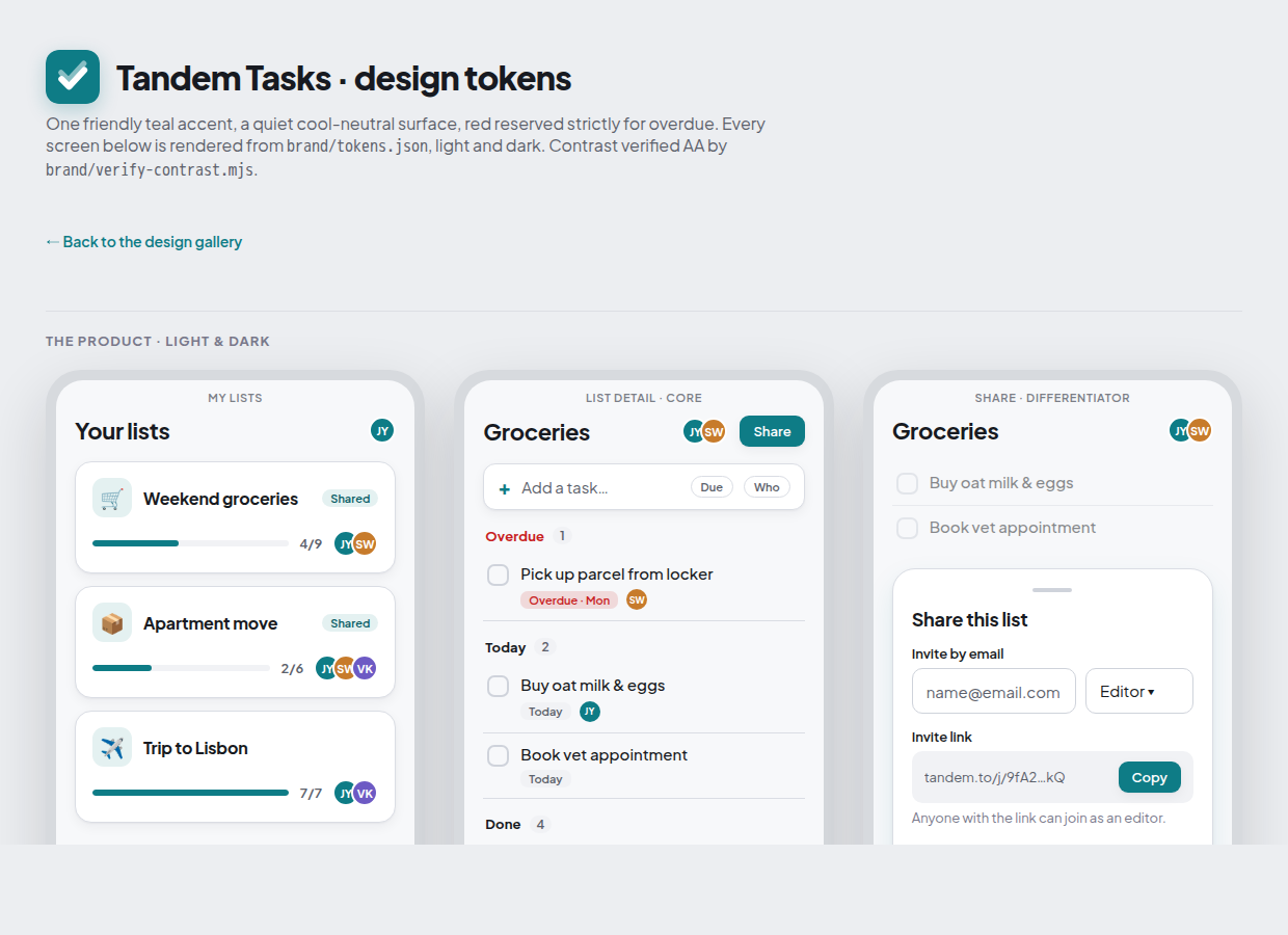
- One friendly accent: teal for checkboxes & primary actions
- Red reserved strictly for overdue, nothing else
- Full light + dark themes, verified AA contrast
- Plus Jakarta Sans · 8-step type scale · 4pt grid
Head-meta kit
Favicon & app icon
One kit shipped into both apps: favicon.svg, multi-res .ico,
16/32 px PNG, 180 px apple-touch, 192/512 maskable, site.webmanifest, and a 1200×630 OG image.

 32
32 16 · tab